

How to choose a suitable calibrator
Understanding Visibility Plots
On the
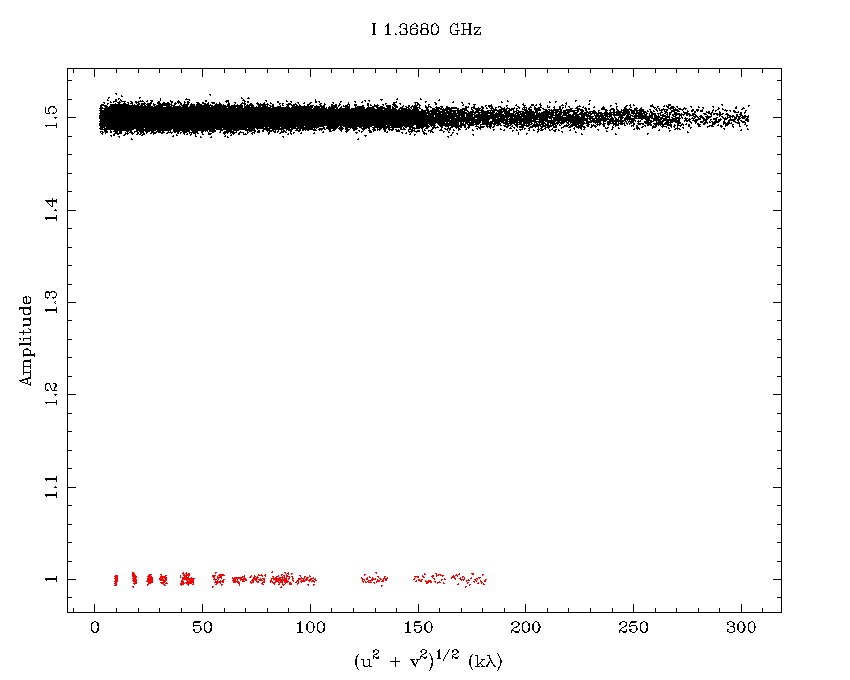
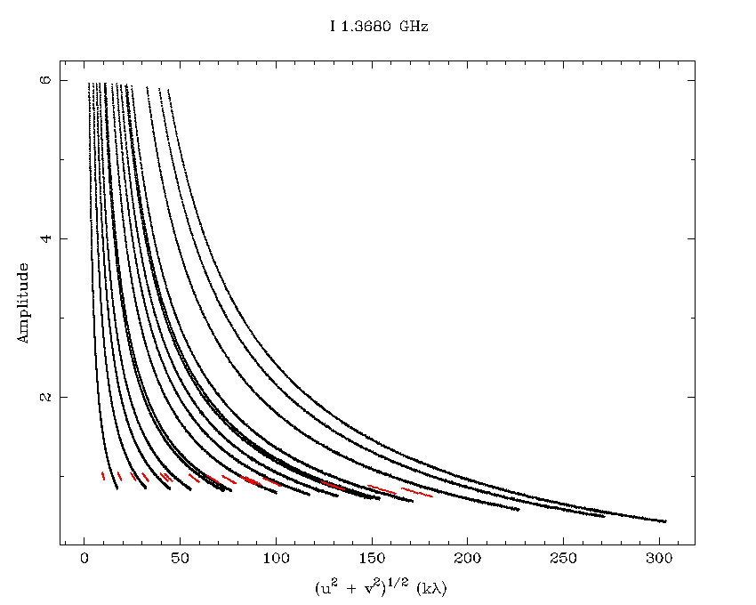
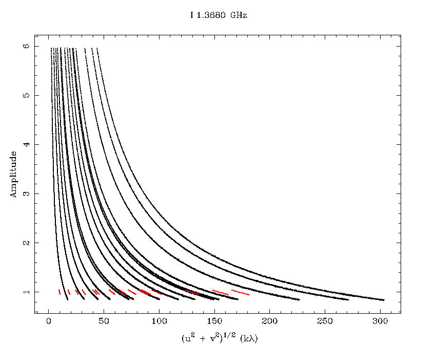
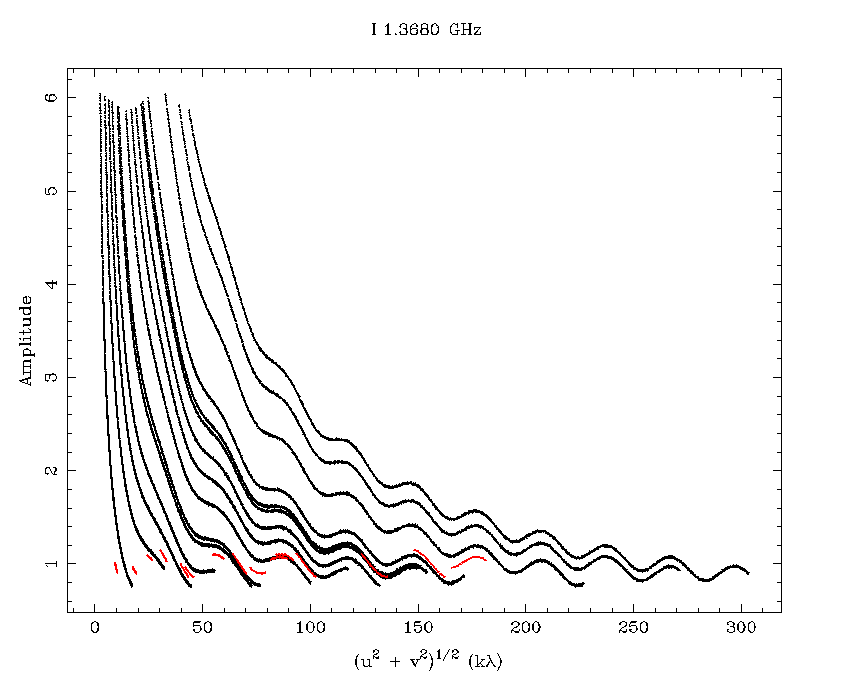
The following visibility plots are for the ATCA primary flux calibrator 1934-638, for the 16cm band.


The top plot shows the amplitude of the calibrator against the uv-distance, which is measured in kilowavelengths. This plot is there to provide an indication of whether the calibrator is resolved, or if there is a confusing source in the field. The bottom plot simply shows the uv-coverage for the data shown in the top plot.
The different colours in each plot correspond to different measurements of this calibrator, primarily due to the different epochs it has been observed in by the ATCA calibrator project, C007. Each different colour corresponds to a different measurement, and the colours are consistent between the top and bottom plots.
There is one plot per ATCA frequency band, not one plot per frequency. For example, on these plots, the black points correspond to CABB measurements that had 2 GHz of frequency coverage centered on 2.1 GHz. The set of colours that align with a flux of approximately 15 Jy are from old-correlator measurements that had 128 MHz of frequency coverage centered on 1384 MHz, and the colours at approximately 11 Jy cover 128 MHz centered at 2368, 2450 or 2496 MHz.
There is a lot of information contained in a amplitude vs uv-distance plot, and the rest of this section uses simulated datasets to illustrate how particular facets of a calibrator will appear in such plots.
Flat-spectrum, point-source calibrator
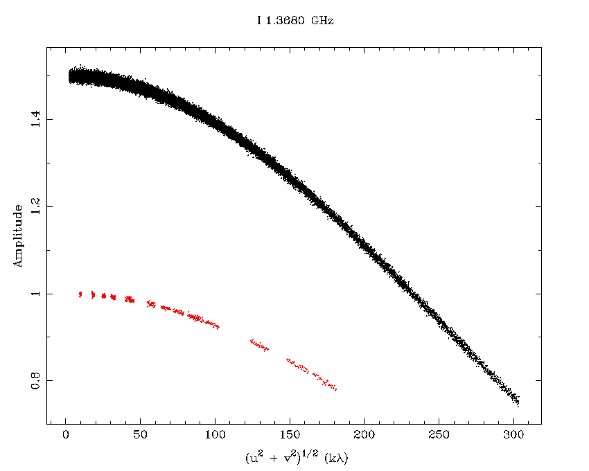
A source is most useful as a phase calibrator when it is a point source at the best resolution of the array that you will be using. The next plot shows an amplitude vs uv-distance plot would look like for a point-source that had a flat spectrum, ie. the same amplitude regardless of frequency. The CABB data is shown in black, and the old correlator data is shown in red. The amplitude of the source in the CABB data is different to that in the old correlator data to provide some separation in the plots. As you can see, a point source has the same amplitude regardless of the interferometer's baseline length. You can also see just how much more uv coverage the CABB system gets you! (This simulation was done in the 6A array.)
Flat-spectrum, resolved source
By way of comparison, we now show what this plot looks like if the source is not a point-source. The following plot looks at a circular source with a radius (out to the half-maximum power point) of 18 arcseconds, in the 6A array. The flux of the source is the same as for the point-source example above, and the source is still flat-spectrum. As you can see, the flux seen by the interferometer drops as the baseline length increases, as expected. A source with a plot like this should be avoided as a calibrator.
The next plot shows the same circumstances but with source with a radius of 3.18 arcseconds. The decrease in amplitude with baseline length is more subtle now. A source like this would work well as a phase calibrator for short arrays, but not for long arrays.
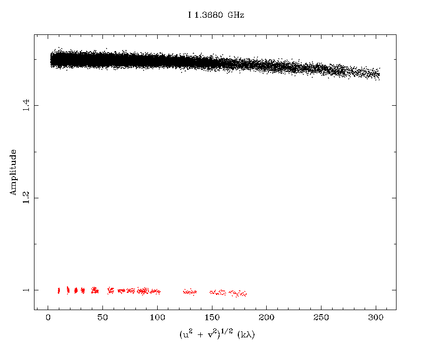
From these plots we can say that the flux observed for a resolved source will decrease as the baseline length increases.
Flat-spectrum, confused source
Now we look at how the plot changes when we have more than one bright source within the field. For the next plot, we have two point sources: a very bright one at the phase centre, and another source of 100 mJy 8.5 arcseconds away from it. For this situation, we see that the observed flux can now be either increasing or decreasing as the baseline length increases - it is close to a sinusoidal pattern for this example.
Steep-spectrum, point-source calibrator
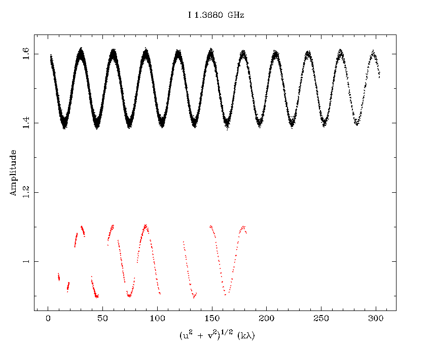
Now we allow our calibrator to be more realistic by giving it a spectral slope: in this case we will give it a spectral index of -1, indicating that its amplitude will decrease with increasing frequency. Its amplitude vs uv-distance plot is shown below.

Look carefully at all the ways this plot differs from the plots of the flat-spectrum source that we have seen so far. The most important difference is that this plot is no longer single-valued with respect to uv-distance. That is, there are many amplitudes at any particular uv-distance, at least for the CABB data. Why? Count the number of distinct curves in this plot: there are 15, one for each baseline in the 6A array. On each baseline, we can see the source's spectrum, going from a high amplitude at the lowest frequencies (which correspond to the longest wavelengths, and therefore the shortest baseline lengths in kilowavelengths), to low amplitude at the highest frequencies. The spectrum always starts at the same high amplitude, and ends at the same low amplitude.
Steep-spectrum, resolved source
To make it clearer that the previous plot shows an unresolved calibrator, lets look at a resolved source with the same spectral slope. The next plot shows a source with an angular size of 18 arcseconds, as in a previous example. Look at the amplitudes at the ends of each baseline curve and you will see that as the baseline length increases, the amplitudes decrease: a sure sign that the source is resolved.
The decrease in amplitude is more subtle though when the calibrator has a radius of only 3.18 arcseconds, as the plot below shows. From this plot it would be very difficult to tell if the source was slightly resolved.
Steep-spectrum, confused source
The next plot shows a confused field containing two point sources, just like the confused example above. The difference here is that the source at the phase centre is now steep-spectrum, although the source away from the centre is still flat-spectrum. The important thing to take note of in this plot is that each peak and trough resulting from the field confusion is aligned in uv-distance. This would not be the case if there were some sort of continuum feature in a single source. Such a feature would occur at the same frequency on each baseline, but this would translate into a different uv-distance dependent on baseline-length.
Back to 1934-638
Let's look again at 1934-638 now and try to understand it.
Start off by looking at the black points. They cover a much larger spread of amplitudes than the coloured points do, and we can attribute this to CABB's extra bandwidth, and 1934's steep spectral index. We can see that the flux at the top and bottom of the curves stays constant, and certainly doesn't drop off with increasing uv-distance, indicating that 1934-638 is unresolved.
We can also see what array the observations were made in. For the CABB data, it is clear that there is a lot of data at short spacings and then a big gap between them and the long spacings. It is likely then that this observation was made in a compact configuration with non-CA06 baselines less than 375m.
You might also note that the curves are not smoothly connected like they appeared in the simulated plots above. This is due to the C007 data reduction process, which averages CABB data into 32 channels, each 64 MHz wide, before making the plots. This is to improve the S/N ratio for sources with low flux densities.